


Full View
Similar items
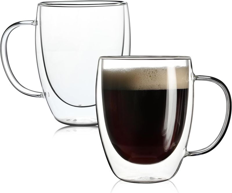
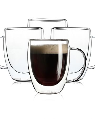
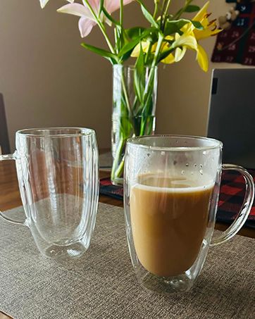
Aurzen 2 Pack Double Walled Glass Mugs With Handles, Large Insulated Layer Coffee Cups, 12oz Clear Borosilicate Mugs,
AU$59.94AU$90.83
Color : 12oz-4Pack

Quantity :
 Customer Service
Report
Include copyright infringementFree Standard Shipping. See details
Estimated between Fri, Dec 12 and Sat, Dec 20
You can return the product within 30 days of receipt. See details
Shop with confidence

Money Back Guarantee
Get the item you ordered or your money back. Learn more
About this item
Sourced from HomeCraft Emporium
Seller assumes all responsibility for this listing.Item number: 30632819
Item specifics
Item description from the seller
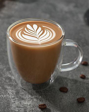
2 Pack Double Walled Glass Coffee Mugs with Handles, Large Insulated Layer Coffee Cups, Clear Borosilicate Mugs, Perfect for Cappuccino, Tea, Latte, Espresso, Hot Beverage, Wine, Microwave Safe: Double wall design, effectively keep hot and cold drinks for a long time, and prevent condensation from forming on the outer wall of the cup.
Large Capacity: These coffee mugs capacity is 12 Oz, which is larger than most mugs on the market. They are suitable for most coffee shops, families, and cafes.
Premium Glass: Made of high-quality borosilicate glass, which is lead-free and BPA-free. Strong and durable, clear and smooth, easy to clean, and dishwasher safe.
Unique Design: The handle of the glass mug is designed with a curve, which is more comfortable to hold. The thick and solid glass body is not easy to break, and the smooth surface makes it easy to clean.
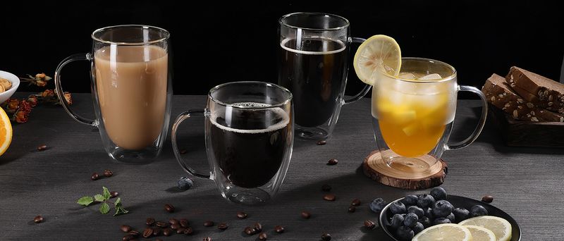
Wide Application: These coffee mugs are suitable for various ocns, such as home, office, party, and so on. They are also ideal gifts for birthdays, anniversaries, weddings, Christmas, and other festivals.
From the brand
.aplus-v2 .container-with-background-image function logShoppableMetrics(moduleName, showsAddToCart) } /* * Used when device = desktop * Configured in: configuration/brazil-config/global/brand-story.cfg */ /* Because the carousel is implemented as an ol list, any lists in the card text will have a secondary list style (letters). This will give an incorrect appearance to viewers, so we set all lists to the primary list style (numbers). */ .aplus-brand-story-card ol li /* Top level containers */ .aplus-module .apm-brand-story-hero .aplus-module .apm-brand-story-card .apm-brand-story-hero, .apm-brand-story-card .aplus-module.brand-story-card-1-four-asin .apm-brand-story-card /* Full background image (Hero 1 -webkit-box-sizing: border-box; box-sizing: border-box; overflow: hidden; position: absolute; width: 100%; height: 100%; } /* Card 1 small images */ .aplus-module .apm-brand-story-image-grid .aplus-module .apm-brand-story-image-grid .apm-brand-story-image-em .aplus-module .apm-brand-story-image-grid .apm-brand-story-image-em .apm-brand-story-image-link .aplus-module .apm-brand-story-image-grid .apm-brand-story-image-em .apm-brand-story-image-link .apm-brand-story-image-img /* Card 3 image */ .aplus-module .apm-brand-story--image /* Text overlays */ .aplus-module .apm-brand-story-text-bottom .aplus-module .apm-brand-story-hero .apm-brand-story-text-bottom .aplus-module.brand-story-card-2-media-asset .apm-brand-story-text-bottom .aplus-module.brand-story-card-1-four-asin .apm-brand-story-text .aplus-module.brand-story-card-1-four-asin .apm-brand-story-text.apm-brand-story-text-single .aplus-module.brand-story-card-1-four-asin .apm-brand-story-text h3 .aplus-module .apm-brand-story-slogan-text .aplus-module .apm-brand-story-faq .aplus-module .apm-brand-story-faq-block .aplus-v2 .apm-brand-story-carousel-container .aplus-v2 .apm-brand-story-carousel-hero-container, .aplus-v2 .apm-brand-story-carousel-hero-container > div /* Ensuring the carousel takes only the space it needs. The sizes need to be set again on the absolutely positioned elements so they can take up space. */ .aplus-v2 .apm-brand-story-carousel-container, .aplus-v2 .apm-brand-story-carousel-hero-container .aplus-v2 .apm-brand-story-carousel-hero-container, .aplus-v2 .apm-brand-story-carousel-hero-container > div .aplus-v2 .apm-brand-story-carousel.a-carousel-container /* This centers the carousel vertically on top of the hero image container and after the area (125px). Margin-top = (heroHeight - cardHeight - AreaHeight) / 2 + AreaHeight */ .aplus-v2 .apm-brand-story-carousel .a-carousel-row-inner /* Cards need to have a width set, otherwise they default to 50px or so. All cards must have the same width. The carousel will resize itself so all cards take the width of the largest card. The left margin is for leaving a space between each card. */ .aplus-v2 .apm-brand-story-carousel .a-carousel-card /* styling the navigation buttons so they are taller, flush with the sides, and have a clean white background */


Videos
Videos for this product


 4.4 out of 5 based on 7,646 reviews